Role: Product Designer
Worked closely with researchers to develop a comprehensive research plan that included an initial assessment of the current onboarding flow, as well as follow-up concept testing sessions to validate our design work. Designed a flow that better met user needs and goals, based on research feedback and anthropological data.
Impact
Redesigned the overall flow to incentivize users to fully convert (create®ister an account) Guided users to the appropriate plan by using their tax ID to display eligible account plans. Built trust with users by revising the tone of voice and making information accessible throughout the journey.
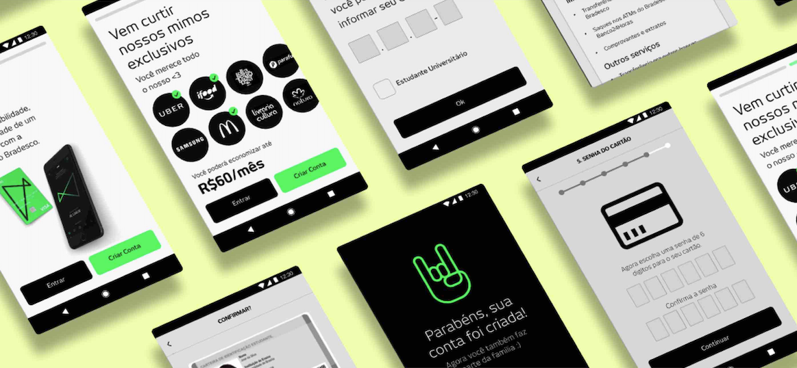
Previous Flow
Identifying Key Pain Points from user research
After conducting a 2-day usability study where we observed how people moved through the current process, we identified distinct patterns:
Users don’t see the value in being a customer
Users feel anxious and uncomfortable giving up their personal information
Users struggled to understand the errors they made
Users were fatigued by the length of the process
Understanding the Brazilian Socioeconomic Situation
We collaborated with the bank’s anthropologist to create personas that influenced most of our design decisions and served as an important reference point in a collaborative team workshop with the bank’s various department heads.

Drive users to product value quickly
By redesigning the flow to only show eligible plans, we reduced the cognitive load for users who mostly have inadequate financial literacy
“If this bank is going to be part of my daily life, there shouldn’t be so many limitations.” - Anonymous participant
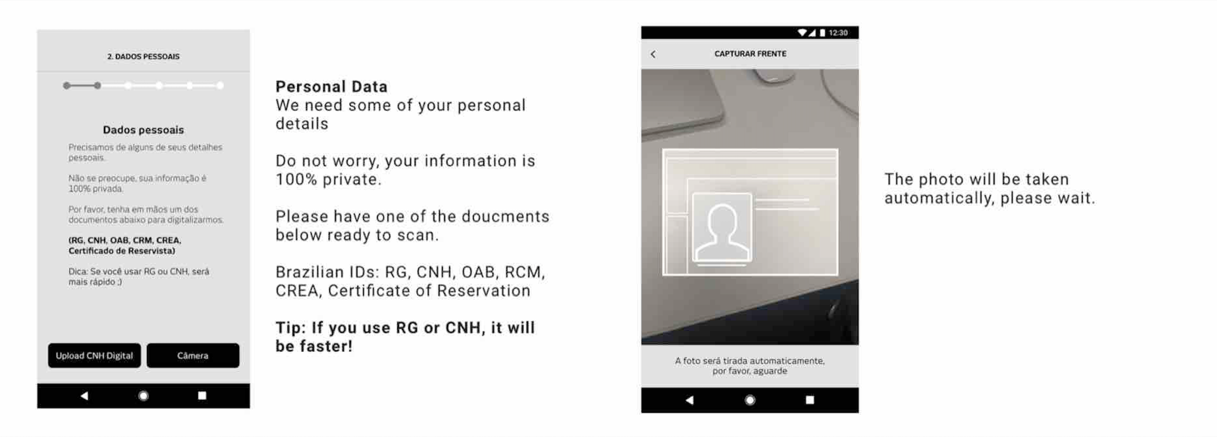
Leverage or technology to reduce friction
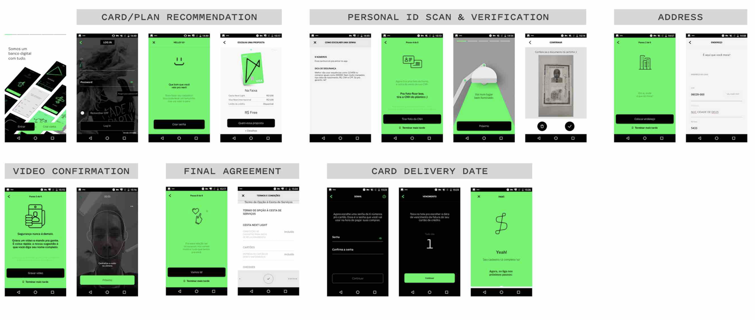
We proposed using the bank’s OCR reader to acquire information from the user’s ID for auto-completing relevant data fields, This solution allows users to skip manual inputs for the screens pictured below:
Educate Contextually
In the previous flow, we noticed users barely read the following tutorial screens, trying to swipe through as fas as possible

We condensed the tutorial down to one briefing screen, followed by the active screen with contextual tips and pointers:
Build Trust throughout the experience
Tone Matters.
Feedback from our users and internal team revealed that the tone of voice felt outdated and cheesy, which impacted their trust in the product.
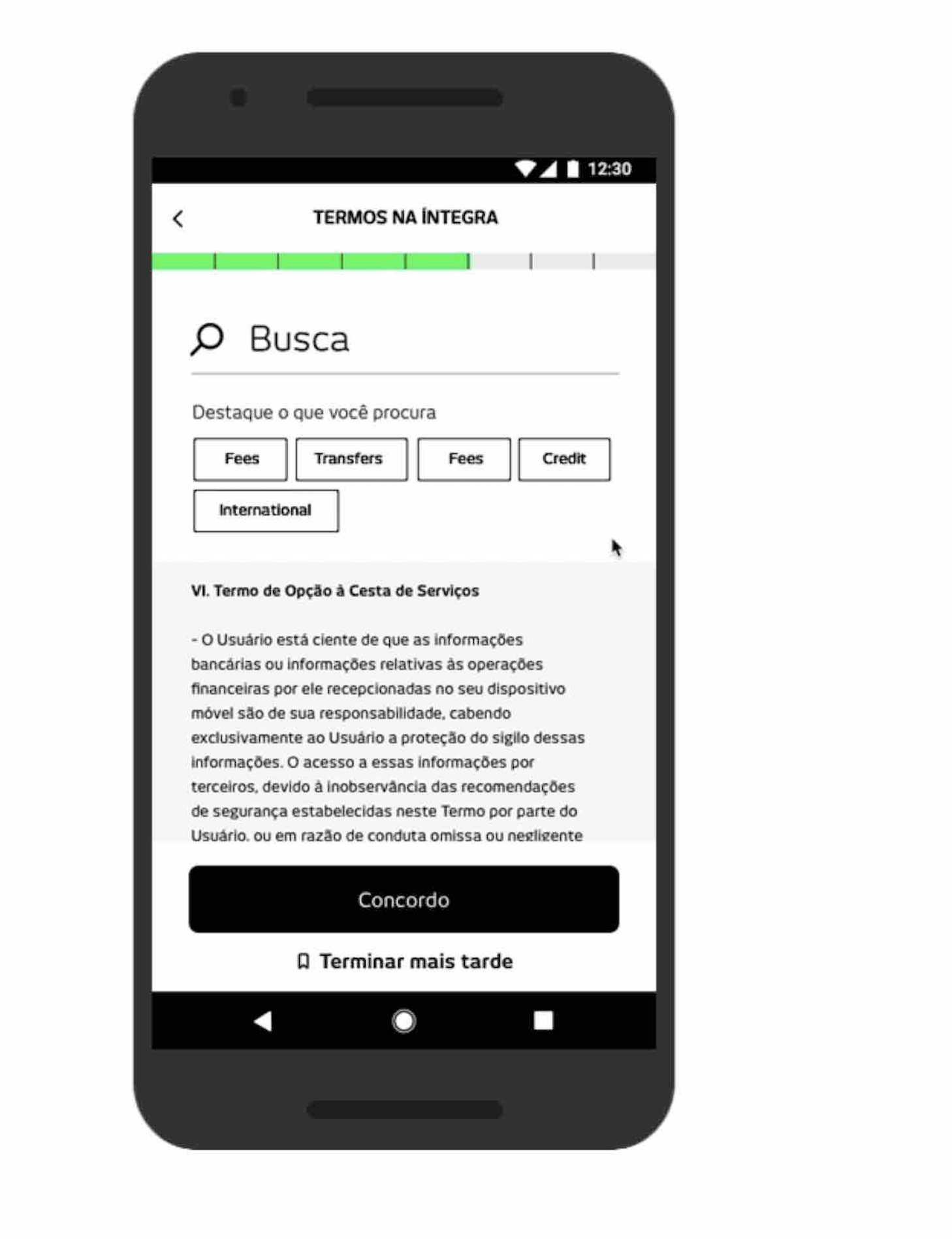
Make Terms & Conditions Accessible
We created a prototype to demonstrate how this information could be more accessible. A large search field with relevant tags should help users hone in on policies they care about, like fees and data privacy.
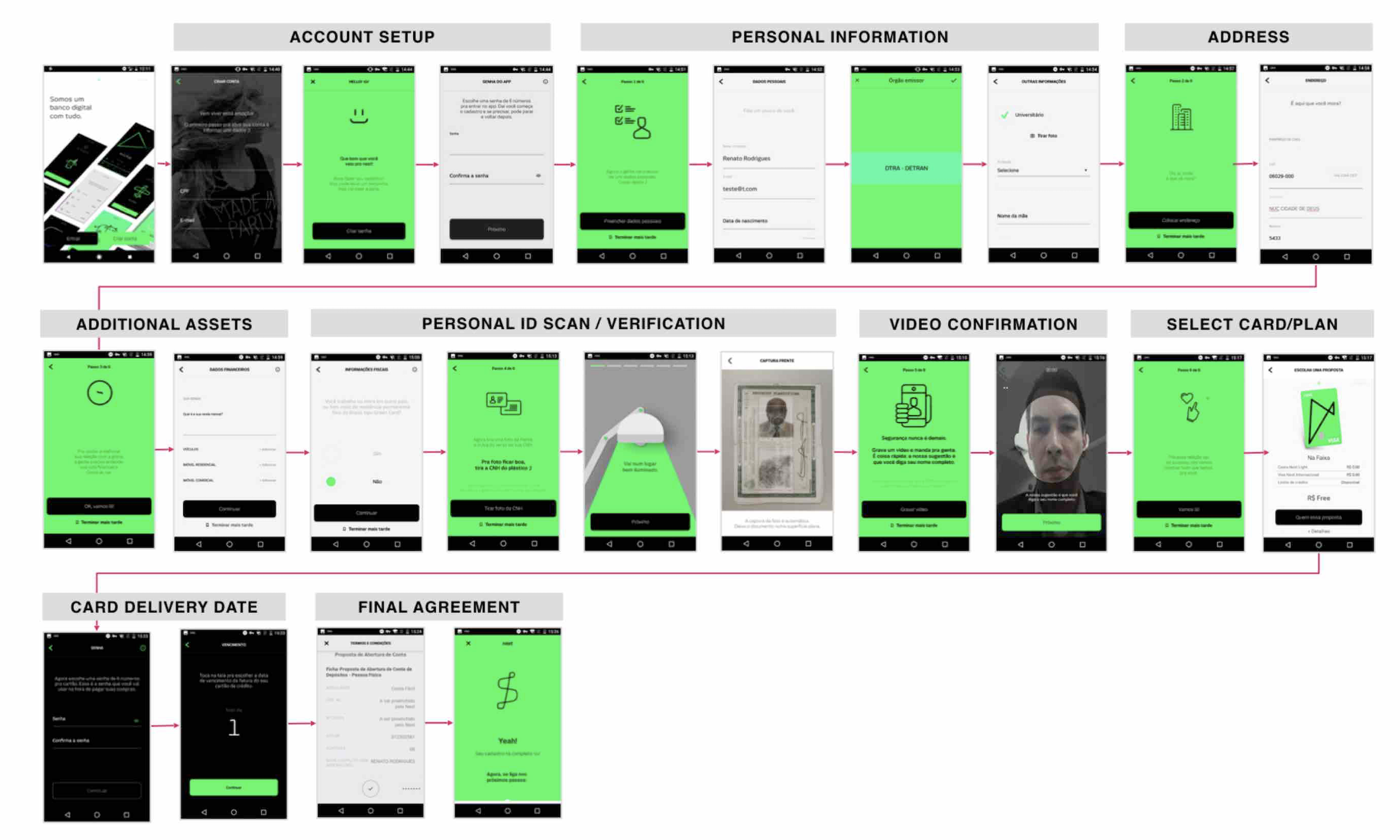
Final FLow
What I learned & Next Steps
Onboarding conversion relies heavily on how quickly you can convey product value to users. When you’ve got them “Hooked,” use technological shortcuts to make the user’s life easier. The fewer form - fields and tutorial screens, the better.
We proposed the following ideas to encourage continued App Engagement:
Educational/Contextual learning messages & notifications
The app should encourage users to check their balances, remind them to pay bills, or offer tips on how to improve their financial standing.
(and for those who have credit/debit, we can still offer tips and tricks on how to maximize points/benefits)
Push notifications around discounts
We learned that exclusive discounts were a major attraction for consumers. The app could send push notifications about a new DISCOUNT, or remind them of remaining monthly discounts.